
The Colour that Keeps Finding Me
Hello lovely!
How are you? How is your heart?
As you may have noticed from my ‘socials’ I have been thinking about winter and the colour blue- but not the bright blue that belongs to summer holidays or cloudless skies, the deeper blues that arrive before the rest of the day has found its colour. They are there when I step outside while the world is still deciding whether it wishes to become morning. The hills carry blue, the shadows beneath the trees carry blue, and even the air seems to borrow a little of it before the sun changes everything.
It has stayed with me because these are the blues that accompany me most often. I have begun to wonder whether colours become part of our lives in much the same way people do. We do not always remember the first time we met them. One day we simply realise they have been faithful companions for years. When I think of Vancouver where I grew up, I think of the vistas from the top of the mountains - the waves of blue in the atmosphere settled somewhere deep in me –all I could ever see after that moment was blue which is funny given how much it rains and how grey it is most months of the year… I often refer to NSW as Big Sky Country. Everyone who comes in to my studio knows this about me. Whenever I drive between Goondiwindi and Moree, the drop in to NSW is an expanse. My shoulders drop from my ears, and a smile crosses my face. I feel ‘big sky’ in my bones. It is the blue – that version which is crisp, airy, inviting, peaceful, hopeful.
Paint manufactures have created a colour called Cerulean blue which they market as the colour of sky. I have never -not once- used it. My blue sky has some hints of pink and golden yellow, some undertones of ochre and burnt umber, it has liberal use of Payne’s grey, Prussian blue, and French ultramarine mixed in to ‘linen flower’. The strength, the depth, and the delicacy create the atmosphere that I feel when I look at the sky. When I paint the sky, I endeavour to communicate a feeling, not a place, space, or a colourists version of blue.
Rebecca Solnit (she popularized the term mansplaining and wrote the book, Men Explaining Things to Me- which is amazing and infuriating)….wrote beautifully about blue being the colour of distance and longing. The Romantic poets returned repeatedly to blue horizons, not because they were describing the sky alone, but because the horizon has always invited us to imagine what lies beyond it. Blue has never simply been a colour. It has been a way of thinking.
Prussian Blue and French Ultramarine have histories every bit as remarkable as any traveller. Prussian Blue- the first modern synthetic blue - began its life as an accident in a Berlin workshop during the early eighteenth century, when a colour maker searching for one pigment unexpectedly discovered another. Ultramarine, “ultramarinus’ meaning, ‘beyond the sea’, is traced back to lapis lazuli (a stone) that was carried from the mountains of Afghanistan across deserts and seas before skilled hands transformed stone into one of the most treasured pigments Europe had ever known. Imagine caring so deeply about a colour that it is carried across continents, protected like treasure, and ground by hand because nothing else quite possesses the same depth…. To care that deeply for a colour seems unimaginable today; that is luxury, that is treasure. I know this level of dedication exists- small cobblers in Florence show this level of attention and refinement. The same can be said for the making of the linen I paint on. Each piece is prepared by hand.
History has often been told through wars, monarchs, and inventions. I sometimes think it can also be told through colour. Similar to salt, silk, and sugar, entire trade routes existed because people longed for particular pigments. Workshops guarded recipes with extraordinary care. If you can read about the history of Magenta, you will know what I mean (it relates to the French and a war time uniform). Patrons paid astonishing sums because a painter insisted upon the finest ultramarine. Human beings have always travelled remarkable distances in search of beauty which I find reassuring – we share a collective desire to ensure beauty is not an afterthought. It matters, and it always has.
The more I read about these two blues, the more I notice how differently they came into the world. French Ultramarine speaks of patience, craftsmanship, and centuries of accumulated knowledge. Prussian Blue reminds us that discovery has always belonged as much to curiosity as careful planning. Life seems wonderfully full of both. Some things are cultivated over decades while others arrive as we are looking for something entirely different. What is that quote made famous by John Lennon, ‘life is what happens while I am busy making plans’… ? The same can be true for inventions/discoveries or as Bob Ross would say, ‘happy mistakes’.
Blue rarely insists upon itself. Crimson catches the eye while blue reveals itself gradually. Stand beside the sea on an overcast day and notice how many blues begin to appear. It often looks like mud then as you step to the left or right, you get a glimpse of midnight blue. Watch distant hills at first light. Look into the shadows beneath big cedars or gums after rain. What first seemed like one colour slowly becomes many. It is the same for my paintings. The blue changes with the light. It feels alive. Calm, deep, and rich at night, then, as the morning sun reaches across the work, the whole painting seems to lift. It dances.
It occurs to me that familiarity behaves in much the same way. The people we love most rarely astonish us every day. Instead, they reveal new depths over years of shared conversations, ordinary mornings, and countless cups of tea. Colours seem to be similar; they reward those willing to spend time in their company.
Whenever I stand beneath a winter sky before sunrise, the deep blues persuade me to linger for another few minutes. They remind me that not everything beautiful arrives with applause. Some things reveal themselves slowly, rewarding attention rather than haste.
I have come to think that this may be the true gift of Prussian Blue and French Ultramarine. Not that they are rare, or celebrated, but that they continue inviting us to look again, and then look a little longer.
I have now been painting for ten years and, throughout all that time, I have never drifted very far from these two blues. They have remained faithful companions, finding their way into every collection, every season, and every stage of my work. Over the past six months, I have had the privilege of completing a number of commissions in which blue has taken centre stage. They are all quite different. Each began with a conversation, each belongs to a different home, and each now carries a story that is no longer mine alone.
I thought you might enjoy seeing where these blues have travelled…
I wish you a wonderful week.
With love, Jamila xx
PS.
I have been exploring these beautiful blues, along with many other delicious atmospheric hues in a new body of work that will be available in my first ever Brisbane Solo Show…Please save the date: 9th-15th November, 2026. Paddington, Brisbane, Queensland.
More details will be shared in the coming months. xx
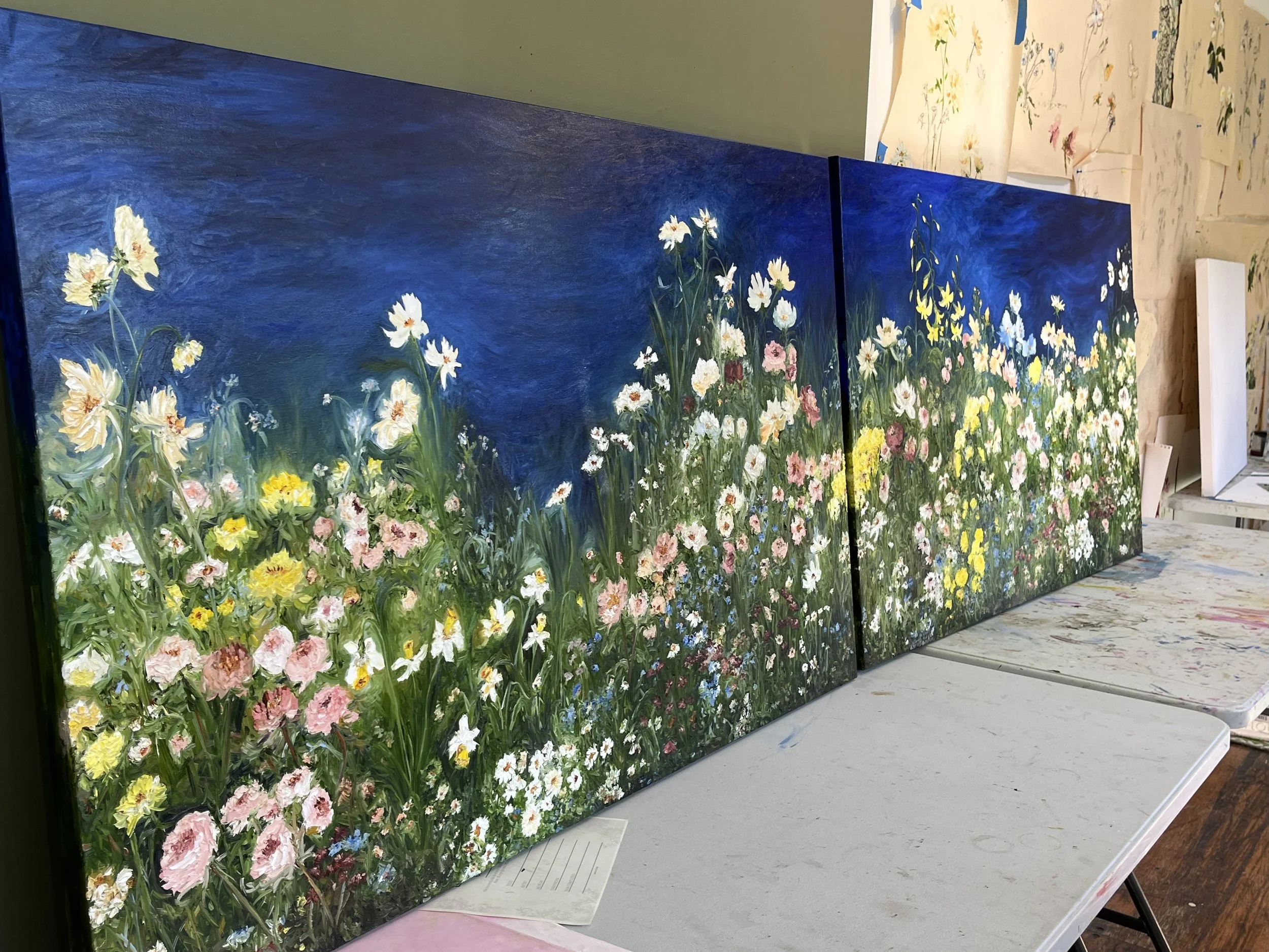
This beautiful 3 metre painting started with a conversation in the collector’s garden. She asked that I paint a deep rich blue background along with what would feel like a walk through her garden. I included , some of her favourite colours - vibrant green, lemon yellow, delicate pink, and rich blue. It was painted on two large linen canvases and was not framed due to the size (300cm x 93cm). This sits in a large long hallway, in a country home in NSW, Australia.
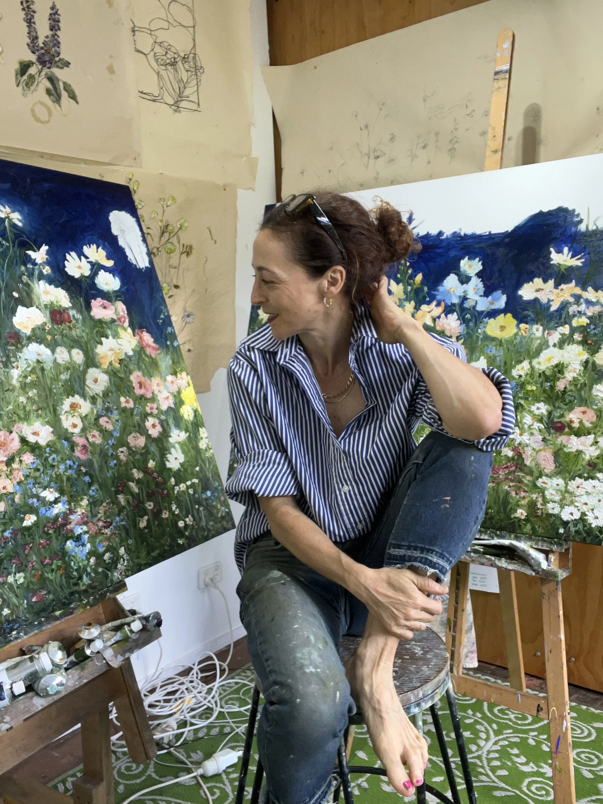
Me, with the large painting. I regretted going barefoot that day….
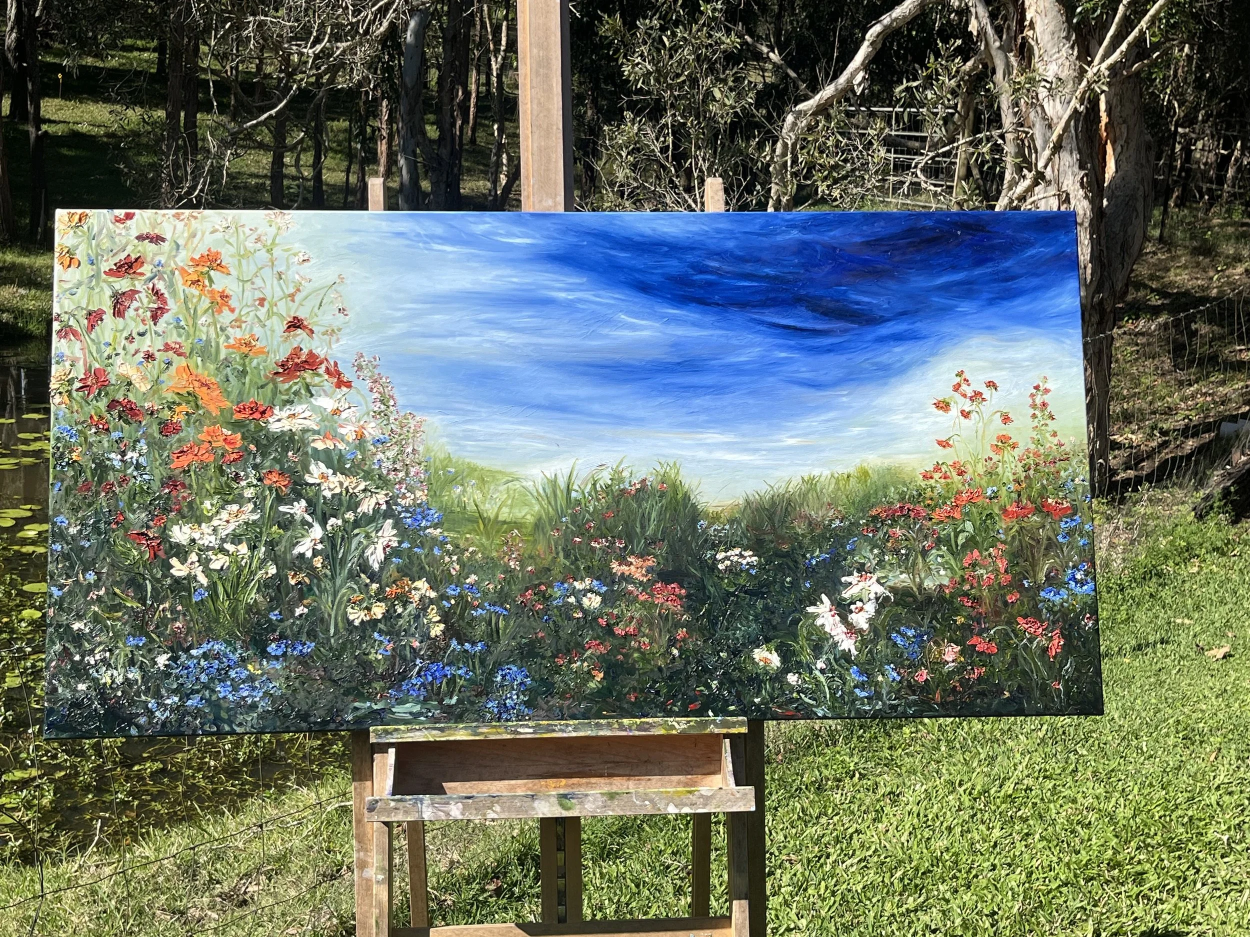
Imagine walking in to a collector’s garden and being greeted by over 100 orchid plants. Imagine then discussing travel and realising you have both been to some of the most remote areas the world. Then imagine having a conversation where the collector admits she knows nothing about colour but dislikes gaudy yellows and pinks -at which we laugh because, doesn’t everyone, and yet no one can describe the colour of ‘gaudy’, so we step back outside and look at her incredible garden and play a game of ‘this, not that’, and in so doing, we create a clear understanding of colour. The painting is a robust…. A moody sky, lush tall grasses to wander through, and a hint of the sea- a nod to her future on the coast. The flowers dance, invite, and delight. The week prior to painting the sky, I had been to the beach. Until I came upon the photograph, I did not really appreciate how much the movement in the sky that one Sunday had impressed me…. This painting measures 153cm x 73 cm (once framed it will be 155cm x 75cm). To view the making of this painting, please visit this link.
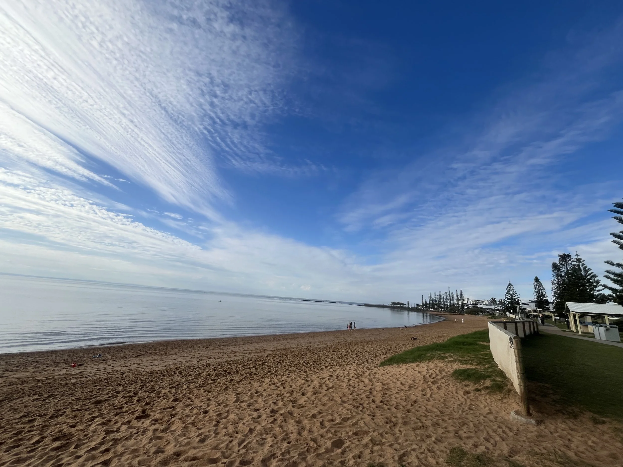
An early Sunday morning walk at the beach with my dogs, Theo and Louis…I snapped this photograph - the movement in the sky captivated me..and influenced my work that week.
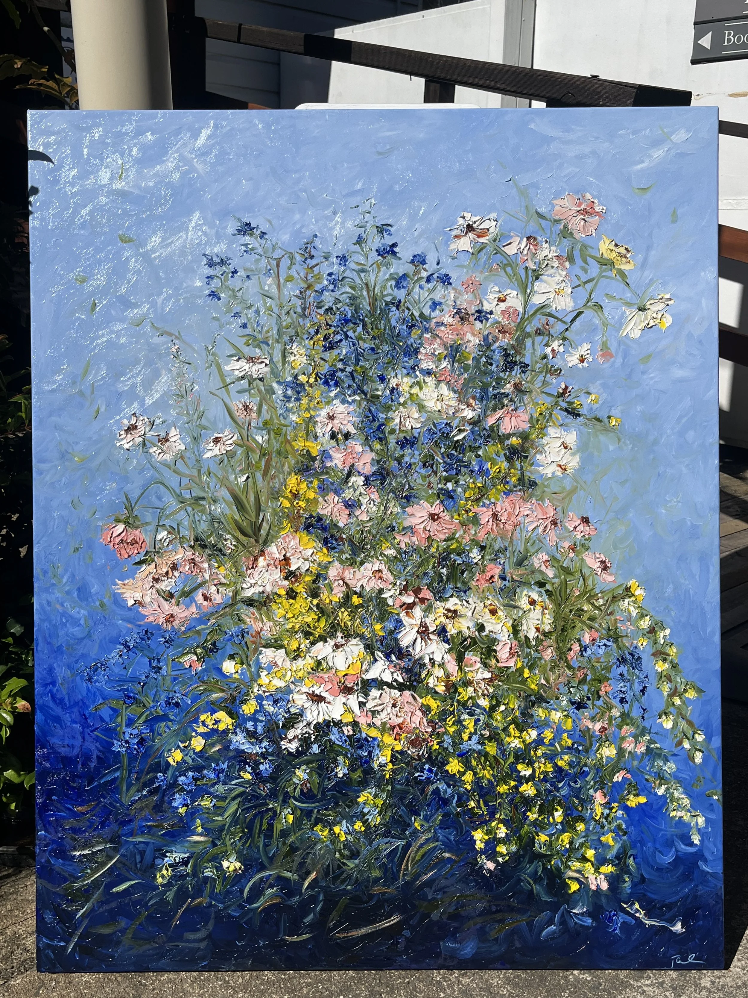
How do you describe a feeling of home, of love, of memories held in the simple gesture of collecting and gifting a bouquet of flowers? This beautiful bouquet is homage to a collector’s mother who loved to gather and create bouquets made from wildflowers growing in the outback. The request: no vase, no straight lines, lots of movement and foliage from eucalyptus; no reds, no oranges, no banksia…Just flow… I thought of an embrace while painting this…a circular gathering of energy and love, accented by cassia yellow, pink and white paper daisies, native crow-foot, tall sunburnt grasses, all gathered and held by wave of eucalyptus…This painting measures 103cm x84cm, framed. To view a video of me explaining this painting visit this link. It too will be framed in a blackwood floating frame and delivered once dry.
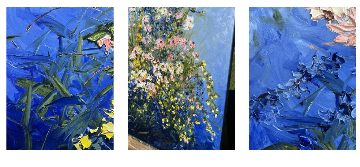
Some of the details from the above commission…
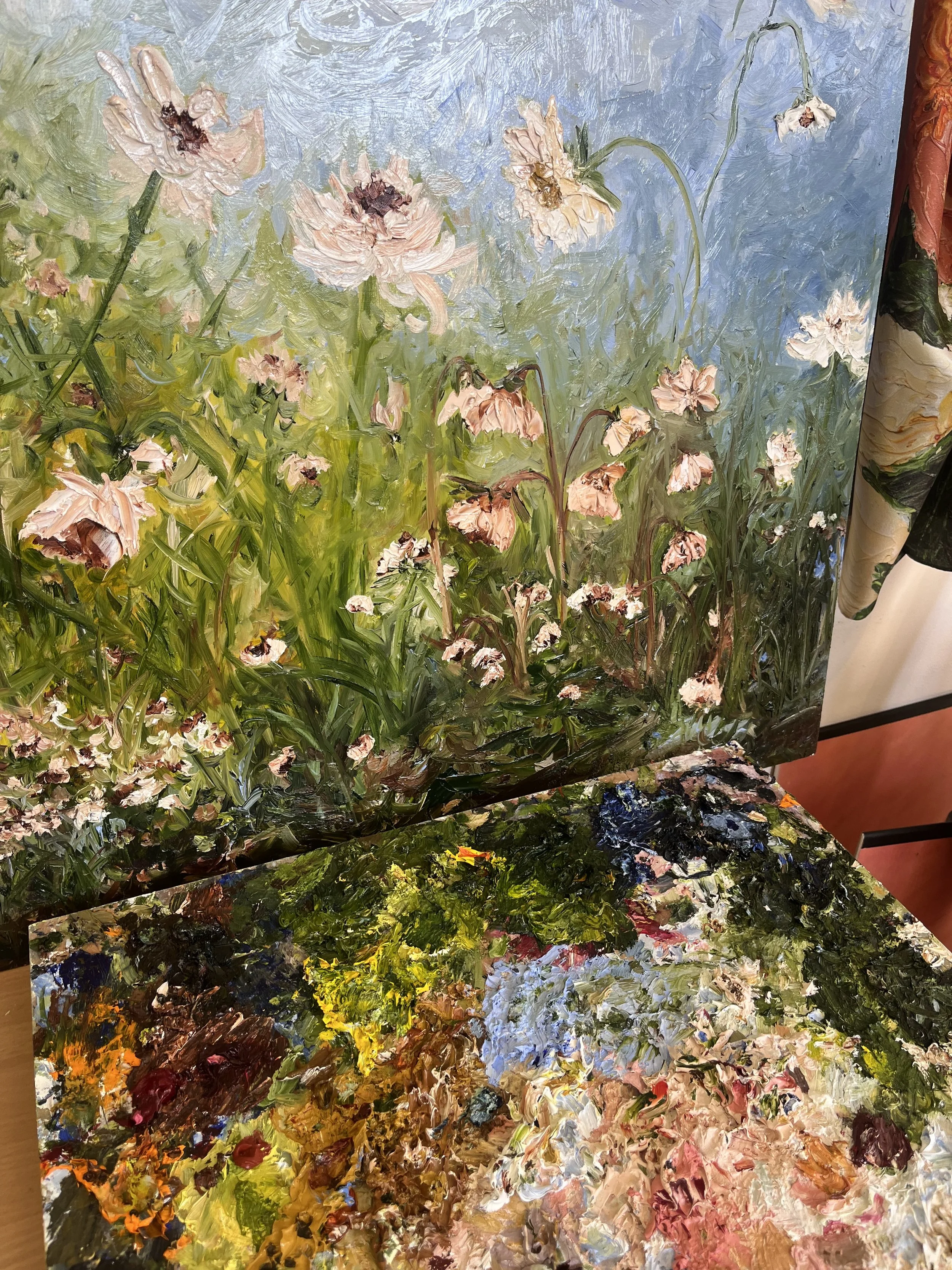
A glimpse in to a new work - an experiment on wooden board. I wanted to understand how the paint, my palette knife, and my hand felt when painting on board. I loved it. This lovely work, 100cm x 70cm is available from my studio. Please reach out with your enquiries.
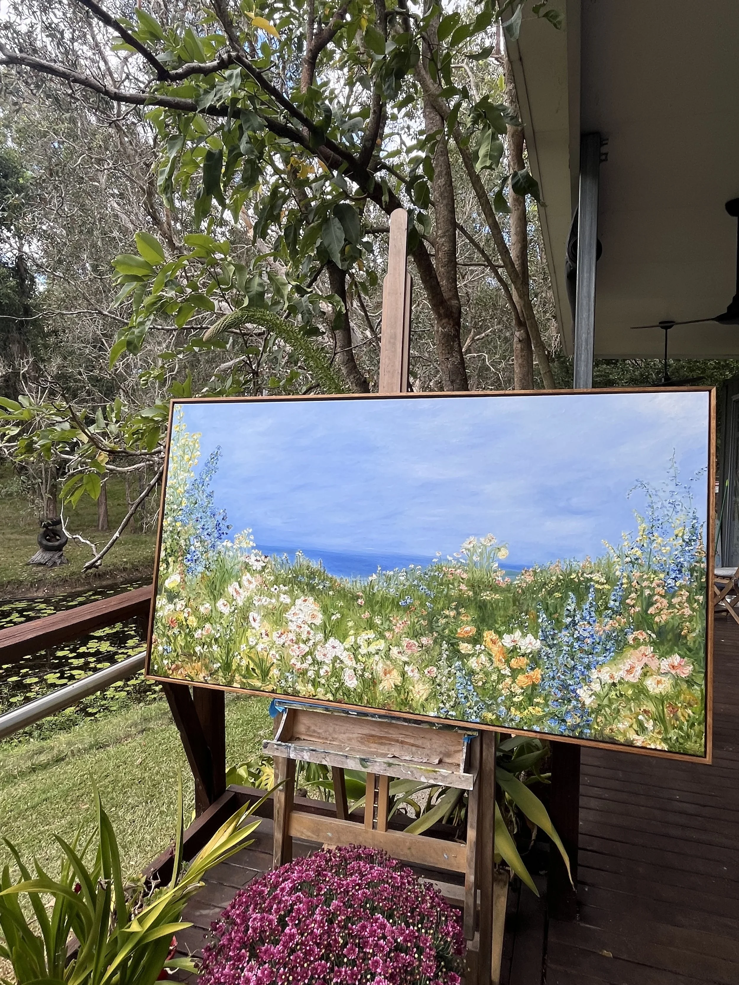
How do you paint the feeling of hope? Vistas, layers of blue, vertical lines of delicate flowers, like feathers on a breeze…This lovely work has been delivered to the collector who asked for a painting that will hang in her fully renovated home, as she commences a new chapter in her life.

What does it feel like to be totally devoted to someone? What colour is tranquility? How do you paint gratitude and love? What kind of environment communicates hope? Each of these questions were answered with this lovely 200cm x 110cm seascape -meadow painting. Dusk holds the tranquility. The vista offers hope and future leaning - love….The meadows in bloom, year on year, nurtured and tended, accepted and celebrated, communicates devotion. This painting demonstrates what I mean when I say that blue is the ever-changing colour that brings so much atmosphere to our homes. The blue sky in this work is incredibly emotive and warm, it holds space while offering breathing room as the light moves across the meadow.
